

Intro
This project was completed by a project manager, designer, developer and myself. I followed the process of research, exploration, and development which stands for RED. Since I worked for the RED Lab, I adhered to these three principles when going through the many phases of this project. I conducted user research, prototyping, visual design, and usability testing all during the span of the project
Problem
Manulife would like to engage their customers more so that they can have a more fluid experience in submitting their claims and checking how much coverage they have in order to do so. Customers usually forget to submit their claim or they do not know their coverage details in order to submit a claim.
Solution
For this project, I had to come up with a solution based on what the business stakeholders of Manulife wanted. They gave a lot of different features for the app but as a UX designer, I focused on the use case of buying glasses. I used this scenario to structure the user journey but the application was dedicated towards customers submitting claims in their group benefits account. It was a fun project as I had a mentor to guide me at certain points, but I had full autonomy in this project, which was an awesome educational experience. It was a great learning experience as I learned how to balance the wants of the business and the users when creating a digital product like this.
User Research
I interviewed 5 people to understand their journey of buying glasses as a whole from researching the store, the shopping experience, submitting the claim, and then finally checking that the claim has been approved with money deposited in the account.

I made user journeys based off how customers bought glasses from the beginning to the end where they check that their claim has been submitted.

I identified pain points in the journey asking users where they felt like their journey should be improved.
Pain Points
Most of the participants found it hard to pinpoint the store they wanted to buy their glasses at because it was a hassle to research themselves, and they had to call in and confirm they accepted their insurance provider.
Checking their coverage was a problem for some users because they don't know how to access their coverage, they don't feel the need to because the portal was complicated, or they just don't have a reason to because they know that the claims experience was going to be difficult.
Submitting claims was the biggest pain point that the users emphasized on because of tedious and long process of filling the form, getting the receipt, and mailing the form to the desired location. Some users would even forget where they placed their receipt and not want to even file a claim.
The post-check process was not necessary for a lot of users as some don't even go into their Manulife account and check that specific claim they filed because of complicated nature of the portal. Most users would just look at their bank accounts to see their benefit deposited.

I looked at 4 phases of the user and identified how they felt in all 4 so that we could focus our designs based off their journey. I made the conclusion that users had a negative experience in the claim and post check process.

I also drew low fidelity wireframes to makes sure my ideas were recorded on paper to user's journey through the app
Use Cases
Based on the pain points given, we decided to focus on four. This would be checking their coverage, submitting the claim, checking that their claim is approved and benefit is deposited, and users would like their receipt and prescriptions stored for future use.
I was able to make my first prototype based on user interviews and insights
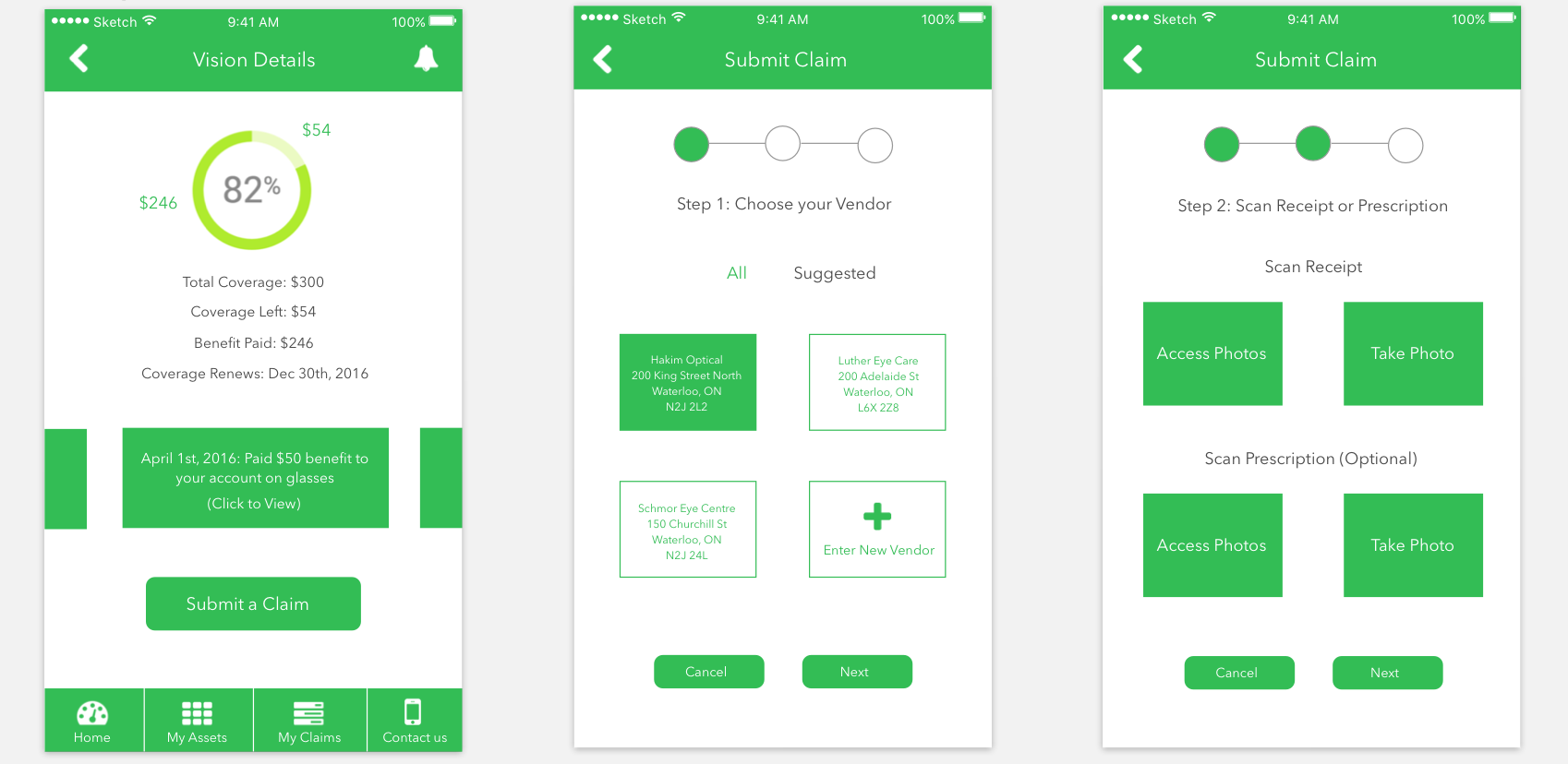
I created my first prototype and then conducted usability testing on users checking their coverage, submitting a claim, and checking their claim status afterwards. I made some changes to the circle graph and simplified the taking photos screen to one step as shown below.
Usability Testing: Challenges & Takeaways
We were able to mock up our prototype so that we could test it on users. Based off usability testing, we changed the prototype to have a more deeper connection to users as we interviewed 5 users again going through the journey of the prototype. Users thought that the calendar and rating system for vendors was not necessary, the graph info was not detailed enough, visual design elements wasn't straightforward, too many steps, wording was confusing, and the notification access was confusing.
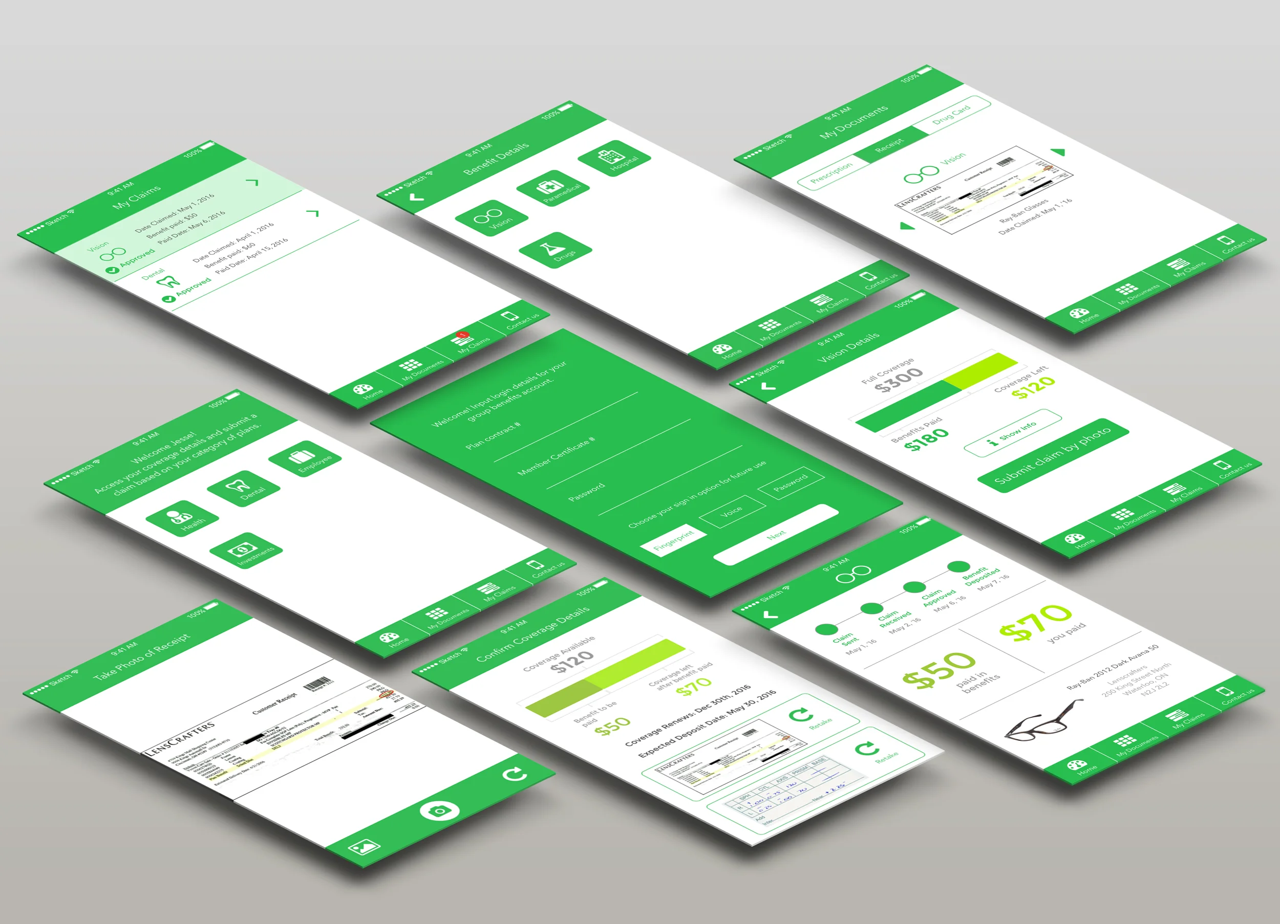
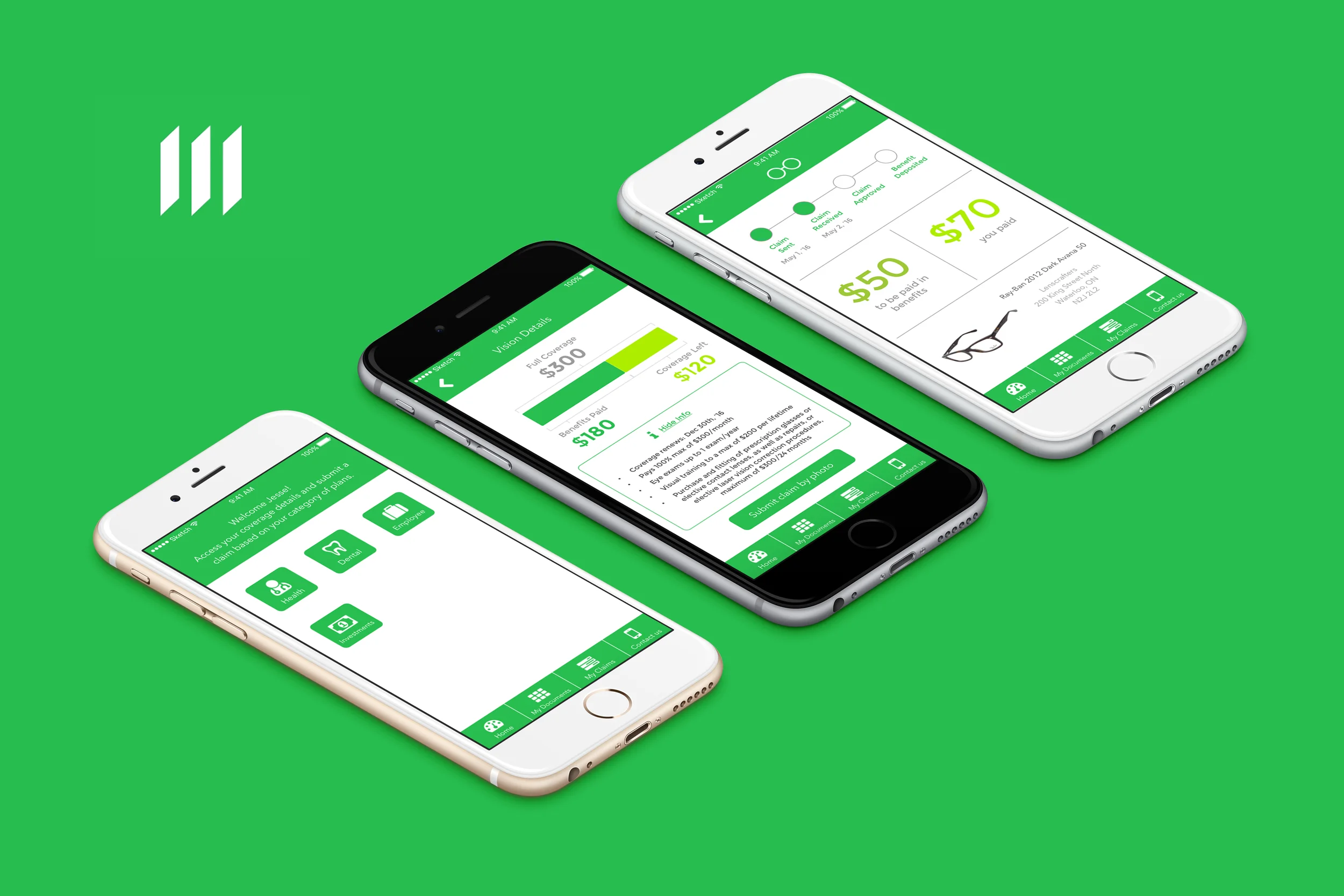
Usability Testing: Final Iterations
With usability testing, we were able to fix how customers view their coverage details because the graph layout was confusing, we decreased the amount of steps needed when users took a photo of their receipt to claim their purchase, we took away certain features like that users don't like, and we simplified the notification interface so that users can smoothly access their updates.
